The Barley Equation

Herein I propose an empirically derived equation to describe the force of attraction between two leashed dogs that desperately want to go sniff each other.

Barley Equation

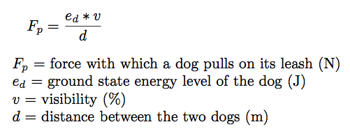
The units match, so at least it has that much going for it. This equation captures the concept that a dog’s desire to go sniff another dog while out on a walk is highest if the dogs pass very close to each other, but is less if the dogs merely see each other from a block away. Unlike, say, the force of gravity, this equation is not symmetric — one dog can experience more attractive force than the other if it is a higher energy breed.

The ground state energy e is a function of a dog’s breed and individual temperament, so it must be determined empirically for each individual dog (although breed-specific reference tables could be used for more general cases). In my particular dog’s case, this value is very low because he is old and lazy.

The visibility v is a percent visibility that accounts for factors such as fog or intervening cars, trees, or buildings that partially or fully obstruct the dogs’ view of each other. Notice that in the case of 0% visibility (i.e. the dogs can’t see each other at all), F drops to zero. This agrees well with empirical observation.

And, of course, it’s called the Barley Equation because if I ever got to name an equation, I’d most certainly rather name it after my dog than after myself.

Posted in Dog

The most irritating differences between R and Python

Lately I’ve been switching back and forth between R and Python for data analysis, so I’ve been getting used to keeping track of the many differences in syntax and behavior between the two languages. I don’t think I’d argue that either way is right or wrong most of the time; they’re just different due to their different histories and conventions.

In most cases where the languages differ, a valid R expression will produce an error in Python or vice versa, making it easy to tell that something is wrong. What makes these three differences irritating is that they’re all instances where the syntax looks the same but the meaning is different, making it easy to write code that fails silently. This makes it easy to get an incorrect result with no indication that anything is amiss.


1. R’s arrays are 1-indexed, while Python’s arrays are 0-indexed.

In R, element 1 is bubbles:


Image


In Python, element 1 is turtles:

Image

There’s a fascinating history behind the origin of 0-indexed arrays, by the way.

2. In Python, assignment between two names binds both names to the same object, while in R, assignment between two names creates a new object.

In R, if I assign “b = a” and then change b, it doesn’t affect a because R creates a copy:

Image


In Python, if I assign “b = a” and then change b, the value of a changes too because both names point to the same object. (I used a numpy array here, but the same is true with other data types.)

Image


To achieve the R-style behavior in Python, use copy() to create a copy:

Image

If you want to achieve the Python behavior in R, too bad, you’re out of luck. As far as I know there’s no way to make two different names point to the same object (although I can’t say I’ve ever desired that behavior in R anyway).


3. The colon operator’s end location is included in the results in R, but not included in the results in Python.

In R, when you subset a data frame using the colon operator, the result includes both the start and end values. In Python, when you slice an array using the colon operator, the result includes the start value but not the end value.

Thus, a[1:3] in R returns 3 elements:

Image

but in Python it only returns 2 elements:

Image


This makes it easy to end up with off-by-one errors if you’re not careful (which are, of course, one of the two hard things in computer science).


IPython Notebook, where have you been all my life?


As a long-time fan of the package knitr for reproducible, human-readable research in R, I’m surprised it took me as long as it did to discover the wonder that is IPython Notebook, which is an equivalent way of logging methods, data, code, and output in a single human-readable file (but, obviously, using Python instead of R). Oh yes, it’s good. Very good. 

The notebooks can be saved as JSON files that are perfect for sharing as Github gists, and the JSON can be converted to HTML using the IPython Notebook viewerHere’s a quick demo notebook that I put together using scikit-learn to do K-means clustering on the iris data set and plot the results, and the accompanying JSON-formatted gist.

This example works with one of my favorite historic data sets, known as either Fisher’s or Anderson’s iris data set depending on who you want to give credit to: Ronald Fisher, the statistician who analyzed the data, or Edgar Anderson, who actually collected and measured all those flowers. (Personally, I’d argue that Fisher already gets Fisher’s linear discriminant named after him, so we ought to let Anderson take credit for the data set!) 

The data set contains measurements of the length and width of petals and sepals for three different iris species found in Canada: Iris setosa, Iris virginica, and Iris versicolor. For this example, I’ve used K-means clustering, since we know a priori that there are 3 species to identify so it’s easy to choose 3 clusters. Results are shown in a 3D plot with the color indicating the label given to the sample by the clustering algorithm.

This very basic analysis is able to achieve pretty good discrimination of the groups in this data set, giving 134/150 (89%) correctly identified samples. 


Image

Martian vacation hotspots: why aliens love Seattle.

I’ve been having a lovely time playing with a dataset containing 60,000 UFO sightings. They come with locations (city/state), and a free-text description field that’s pretty fascinating to read.

To get an idea of the distribution of sightings, I plotted the frequency of UFO sightings by state, normalized by the number of residents. There’s a high number of sightings in northern New England, but the west coast seems to be the biggest epicenter of UFO sightings. Washington state in particular has vastly more UFO sightings per capita than any other state.

Image

Clearly this indicates that when aliens visit Earth, they want to visit the space needle. To get a better sense of what the people reporting the sightings were experiencing, I made a word cloud of the free-text descriptions accompanying the reports from Washington.

Image

Lots of bright lights moving around in the sky!

Continue reading

Using knitr for reproducible research in R

I’ve been using the amazing knitr package for the past year or so, to generate HTML reports of almost everything I do in R. It’s a great way to keep all the parts of an analysis together, in a convenient format that I can easily share with coworkers and collaborators. Maybe this makes me old-fashioned, but I also print these reports and keep hard copies on file (in addition to the copy on my hard drive, the copy on the Time Machine drive, and the copy on the off-site network drive. I like backups.)
 
Using knitr is ridiculously easy; knitr support is built into Rstudio, and I can write the reports in markdown, the most delightfully simple and readable language for creating HTML. I usually keep the Rmd file I’m working on visible in one pane of Rstudio, while I hack things together at the prompt in another pane. I copy lines of code up into the Rmd file as soon as I have them the way I want them. Rinse and repeat until science.
 
Image
 
The key items I include in an analysis report are:
 
  • The data. If it’s a small amount of data, I include print statements in the code to print the numbers directly into the file. In a more typical case where the data set is much too large to include in the document, I add comments describing the data source: a URL if it’s public data from the web, unambiguous file names and paths to help find the associated files on the network drive, and notes about data generation (“You’ll find the original data in my notebook #9, pg. 35.”, or “Dr. Pineapples generated this data set in 2007 by dropping milkshakes out of the window and measuring the radius of the splat.”).  
  • The code. All the code that generated the analysis. If some parts take a long time to run, knitr makes it easy to cache parts of the analysis. That way the slow parts of the code don’t have to run every time the file is knitted to HTML. 
  • Test/validation code. I like to prove that the analysis is working as expected by checking values and data types along the way. The assertthat package is great for dropping in some automated testing so that the outcome of the tests is baked right into the report.
  • The results, usually numbers and plots. Knitr can embed images in HTML as base64-encoded data URIs, so it’s easy to include graphs in the report without having multiple files to keep track of. I like to insert the images into the file as URIs, and also include statements to print the images as separate files (in a format/resolution suitable for publication). 
 
When it’s this painless to make research reproducible, there’s no excuse not to do it. For more on using R Markdown and knitr in Rstudio, check out the documentation.

Freeing my Fitbit data

I love my Fitbit, but I want to play with the data myself, not just look at the graphs the fine folks at Fitbit have decided I should see. Fortunately, there’s a great step-by-step guide with a script to download Fitbit data into a Google Drive spreadsheet, which handles interfacing with the Fitbit API. 

I downloaded my data beginning with April 2012 when I started using Fitbit. There were 18 days without any steps recorded (days when I forgot to wear the Fitbit or it ran out of batteries, plus a few days when it broke and I had to have it replaced), which I eliminated from the analysis. Other than those few days, I have a complete record of my activity for the past 21 months, which is pretty cool. 

I used Python to plot the daily step counts along with a time-smoothed rolling average to make it easier to see long-term trends. 

Image

The most obvious features to me are the high-step-count spikes during the summer, when I’m most likely to go adventuring outdoors on the weekends. To get a better sense of the distribution of my steps, I plotted a histogram:

Image

I average about 10,000 – 11,000 steps per day, but there’s a lot of variation. I usually end up recording at least 12,000 steps on days when I bike to work, because I find that each pedal rotation registers as a step. I suspect that the tail on the left side of the histogram (<5000 step days) are mostly days when I was sick or otherwise feeling down, because I generally find it downright difficult to walk fewer than 5000 steps in a day unless I have a cold or similar. 

Finally, I broke the histogram down by days of the week. It got a little messy to look at, so I used gaussian kernel smoothing to turn the histogram into a density plot that’s easier on the eyes: 

Image

Most of the days are similar to each other, but Saturday clearly has the most variation, and the most days with very high step counts. In fact, I walk 15,000+ steps 17% of the time on Saturdays, but less than 10% of the time on other days of the week. And on that note, the dog and I are going for a walk. 

Here’s the code I used to generate the graphs: 

[gist https://gist.github.com/8090081 /]

Dental year-in-review

Earlier this year in May, I started tracking my dental hygiene habits by giving myself a sticker on a calendar every time I flossed my teeth. This started because I really hate flossing — there’s nothing inherently fun or rewarding about it, so I wondered if there was anything I could do to incentivize it or make it more fun.

I just kept going with it, and now I have eight months of flossing history to look at. I entered the data into Excel (giving myself a ‘1’ on days where I had a sticker on the calendar and a ‘0’ otherwise), exported it as a CSV, and used python to graph the results broken down by days of the week.

I used python’s matplotlib to make the graph, then I also used RPy to make the graph using R since I’ve never really directly compared graphs made using the two methods. Here’s the matplotlib plot:

Image

and here’s the RPy plot:

Image

I prefer the bars of the RPy plot because they line up nicely without any effort, but I do enjoy how matplotlib turned the y-axis labels horizontal for me. Of course for any more complex plotting I think the advantages of RPy would become much more apparent.

But more importantly: what can I learn about my oral health from this analysis? My flossing habits during the week are quite good, with >80% success rate regardless of the day, but on the weekends I tend to sleep in, fail to follow a standardized morning routine, and consequently end up promising myself I’ll floss at night (hint: it never happens). Don’t tell my dentist.

Here’s the code I used to generate these images:

import numpy as np
import pandas as pd
import matplotlib.pyplot as pyplot
import rpy2.robjects as robjects
from rpy2.robjects.packages import importr
data = pd.read_csv('FlossChart.csv', usecols = [0, 1],
parse_dates = True)
data['daynumber'] = data.date.map(lambda x:
pd.to_datetime(x).weekday())
data['weekday'] = data.date.map(lambda x:
pd.to_datetime(x).strftime("%a"))
fractions = []
names = []
for day in range(0, 7):
relevantrows = data[data['daynumber'] == day]
names.append(relevantrows.weekday.iloc[1])
fractions.append(relevantrows['flossed'].mean())
#First let's plot it using pyplot.
pyplot.bar(np.arange(1, 8, 1), fractions)
pyplot.title('Flossing breakdown by day of the week')
pyplot.ylabel('Fraction of days flossed')
pyplot.xticks(np.arange(1.4, 8.4, 1), names)
pyplot.savefig('Flosschart-py.png')
#Now let's do it in RPy.
r = robjects.r
rfractions = robjects.FloatVector(fractions)
rdays = robjects.StrVector(names)
rfractions.names = rdays
grdevices = importr('grDevices')
grdevices.png(file = "Flosschart-r.png",
width = 512, height = 512)
robjects.r.barplot(rfractions, ylim = robjects.r.c(0, 1),
main = "Flossing breakdown by day of the week",
ylab = "Fraction of days flossed")
grdevices.dev_off()
view raw FlossChart.py hosted with ❤ by GitHub

Coursera Design class wrap-up

I just finished up my final project for the (wonderful!) Coursera class Design: Creation of Artifacts in Society, the PeakPortrait web site. The concept was to create a web app that would allow biologists to produce graphs of genomic location data sets, to let scientists see the overall shape of large data sets at a glance. It works and the code is on Github, so I guess I’m calling it a success.

I’ve been busy blogging about my assignments each week, as I went through half a dozen iterations to reach the final result. It was motivating and inspiring to be a part of a huge internet community of people creating diverse and varied projects — physical objects, services, web apps, interior design, and more. I followed along as classmates created a new interior layout for trains, a better wall-mounted organizer, a water purifier for use in rural India, a travel app, and so many more. Sometimes it just takes a deadline and a bunch of like-minded individuals to make the magic happen, I guess.

Inspirational furniture

FDMTF6RHMLB4EP0.LARGE

I had an amazing time working on the Nagelier, the chandelier that nags you, at Science Hackday 2013. This was my first attempt at inspirational furniture — smart household objects that know about you and encourage you to reach your goals and be your best self.

To bring Fitbit data out of the internet and into the living room, Gabe and Michelle and I created an Arduino-controlled chandelier with an individually-addressable RGB LED strip whose light output is controlled by the user’s current Fitbit step count. A ruby script is used to poll the Fitbit API, quantify your progress towards achieving your daily step goal, and transmit the current state to the Arduino over USB.

If your chandelier is flashing red, you’d better get off the couch and go for a walk.

Check out the instructable, and use the code on GitHub.

Yoga Breathalyzer

F719JFUHMLB48FZ.LARGE

 
Last weekend was the Silicon Chef Women’s Hardware Hackathon at Stripe in SF. The event was hugely successful, with over 200 ladies defying the stereotypical Dave-to-girl ratio of electronics hobbyists. It was just like a gender-neutral hackathon, except that they had smaller-sized tshirts to hand out (yay!), and all the diet sodas were gone in about 2 seconds.
 
Our team of five wanted to make a biofeedback relaxation game. The project took a very, very winding road to a destination far from where we thought we were headed, which I must admit was half the fun. In the process, we looked at several different measures of biological state and anxiety level: galvanic skin response (GSR), heart rate, and peripheral temperature, as well as a few others that we didn’t have the appropriate hardware to implement (eye tracking, respiration rate).
 
We made two different GSR meters, neither of which worked very well. One was based on aluminum foil, while for the other we got to cut some custom PCBs to use as electrodes instead of using the recommended pennies. (Tip: it’s really hard to solder anything to a penny.) Regardless, neither was very effective. Oh, they measured something, but it had no apparent relation to the user’s mental state. Regardless, they were fun to make — learning to design/cut custom PCBs with an Othermill was really, really cool.
 
We also played with a pulse sensor that measures reflected green LED light to quantify heart rate. It turns out that the newer versions of this sensor work pretty well, but the older one we had wasn’t very accurate, so we scrapped the pulse-monitoring idea too. 
 
We put some effort into getting data out of the Arduino and into a Google spreadsheet, with the idea of recording data daily to monitor changes in your biological state over time. This turned out to be weirdly hard; there’s lots of room for improvement in tutorials for this kind of thing. 
 
In the end, we used a temperature sensor to monitor the temperature of the user’s palm, under the theory that stress lowers peripheral temperature, and combined this with a headset-mounted wind sensor to visualize the user’s breath. It actually turned out that the breath visualization aspect was my personal favorite part of the project, so I wrote up an Instructable on it. 
 
We were proclaimed the Most Relaxing hack, but more important, we all gained some new skills and spent an amazing weekend hacking with super smart and delightful ladies and fabulous mentors.